

- Community Settings
- Survey Opt-Out for Members
- Security
- Facebook setup
- LinkedIn setup
- Google setup
- Twitch setup
- Social login
- Mobile app - privacy policy
- HMAC
- External passback
- Google Analytics
- Survey swipe
- Communities Authentication - SAML SSO
- Merge all Pending Surveys
- Regional Sign Ups
- User Roles and Permissions
- Data Sharing Options
- Login Authentication
- Global community member profile
- Profiling surveys
- Default surveys
- Global community profile - settings
- Hidden field
- Move profile fields
- Profile fields - survey integration
- Profile sync
- Confidence score
- Import Profile Data
- Profile Groups
- Default Surveys 2.0
- Profiling Surveys 2.0
- Member Profile Fields 2.0

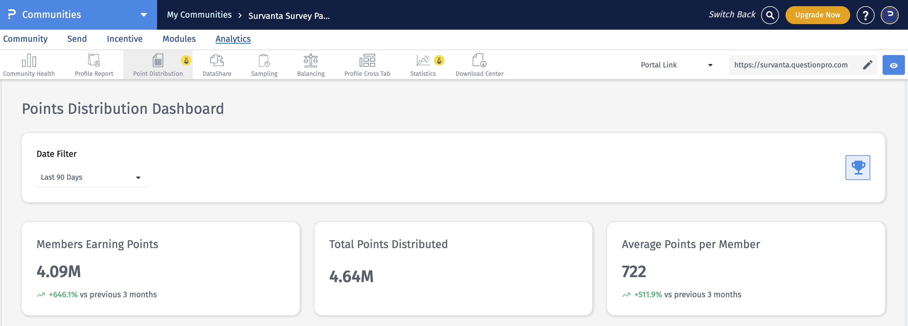
Point Distribution
To access Point Distribution, simply navigate to: Communities » Analytics » Point Distribution
The Date Filter allows you to review point activity for a selected time period. All cards, charts, and detailed views on the dashboard update based on the selected date range.
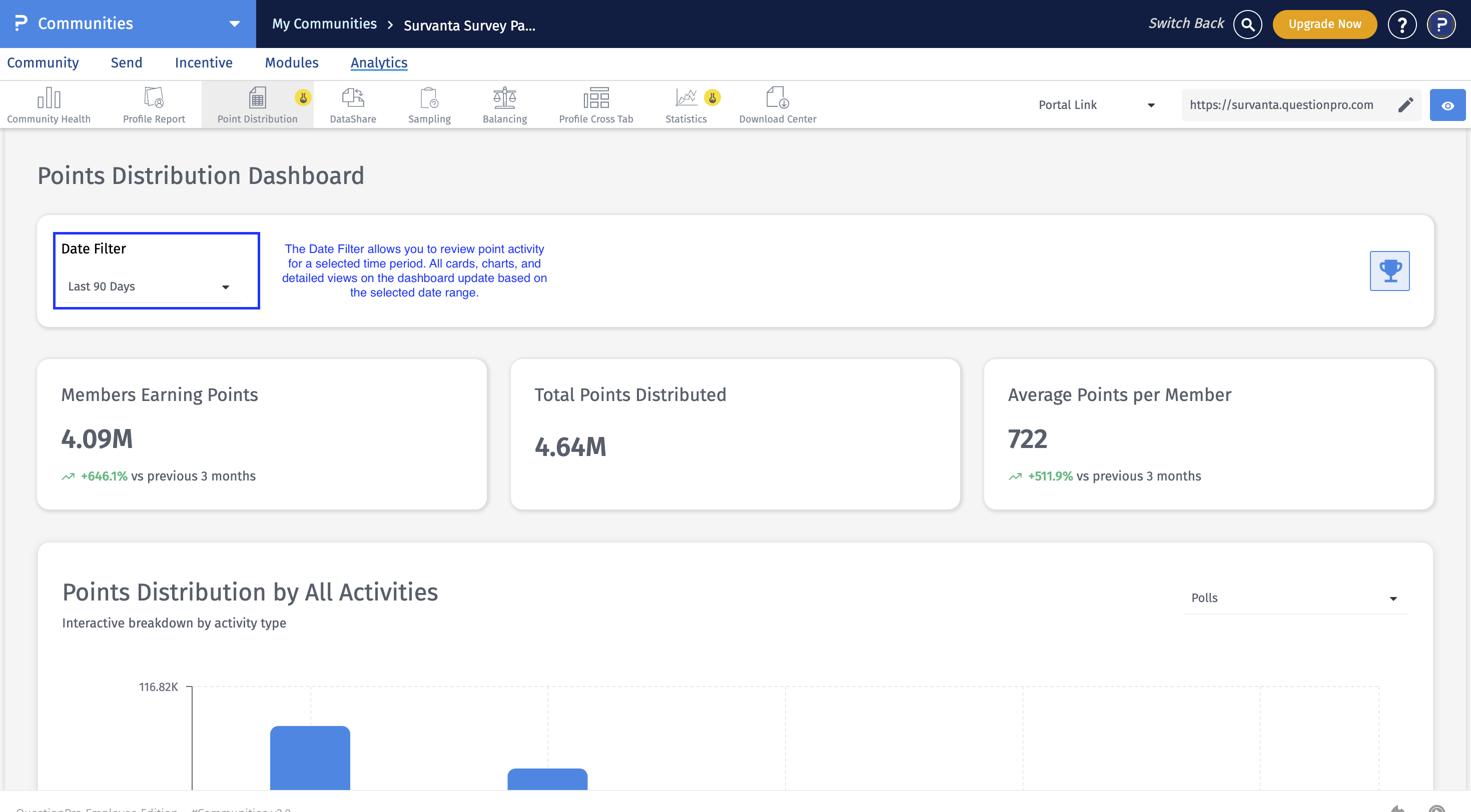
- Last 24 Hours
- Last 7 Days
- Last 30 Days
- Last 60 Days
- Last 90 Days
- Custom Range
The summary cards at the top of the dashboard provide a quick overview of point activity within the selected timeframe.
- Members Earning Points: Displays the total number of members who earned points during the selected date range.
- Total Points Distributed: Displays the total number of points awarded to members during the selected date range.
- Average Points per Member: Displays the average number of points earned per member during the selected timeframe.
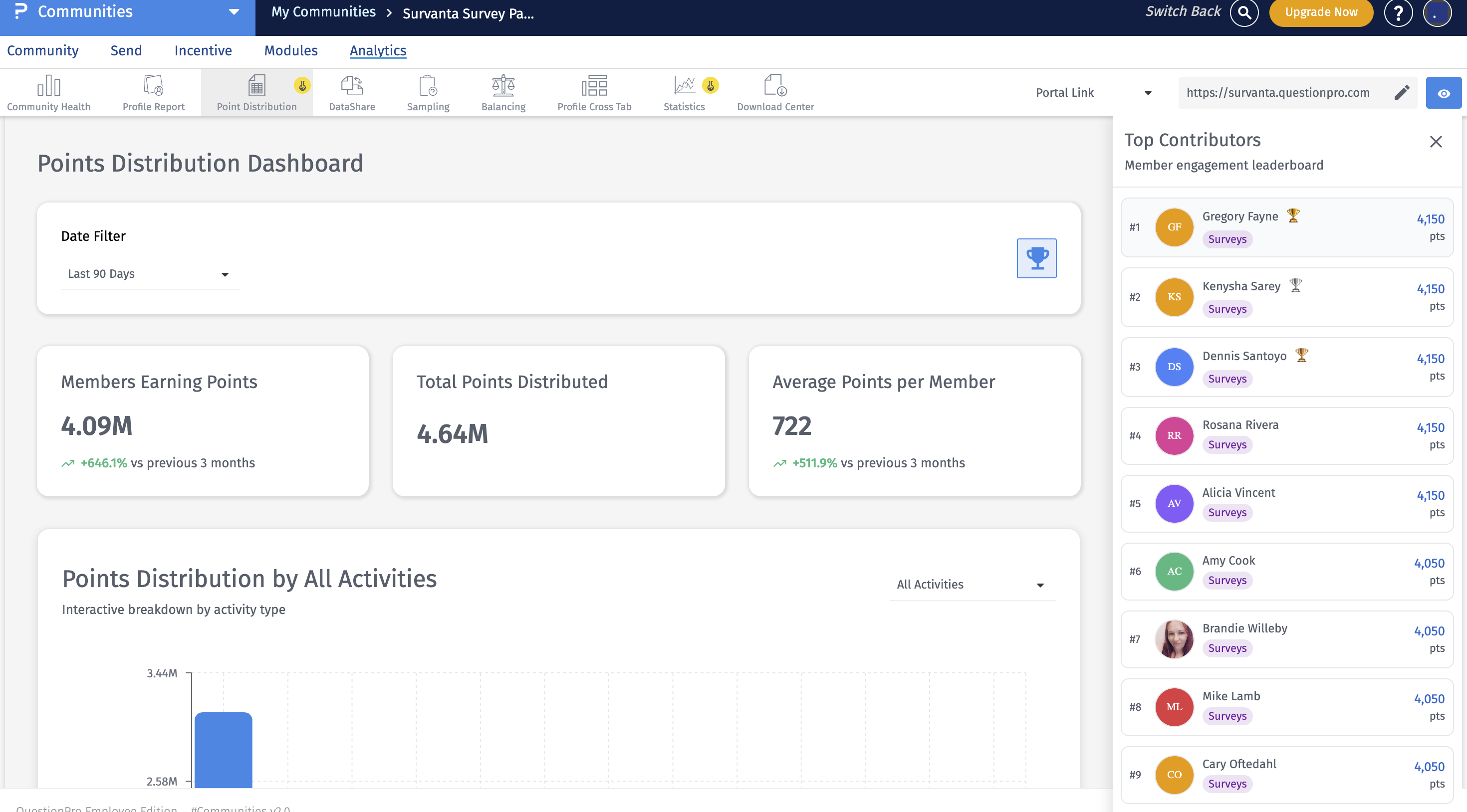 The Top Contributors card highlights the members who have earned the highest number of points within the selected timeframe. This allows you to quickly identify and recognize your most active and contributing members.
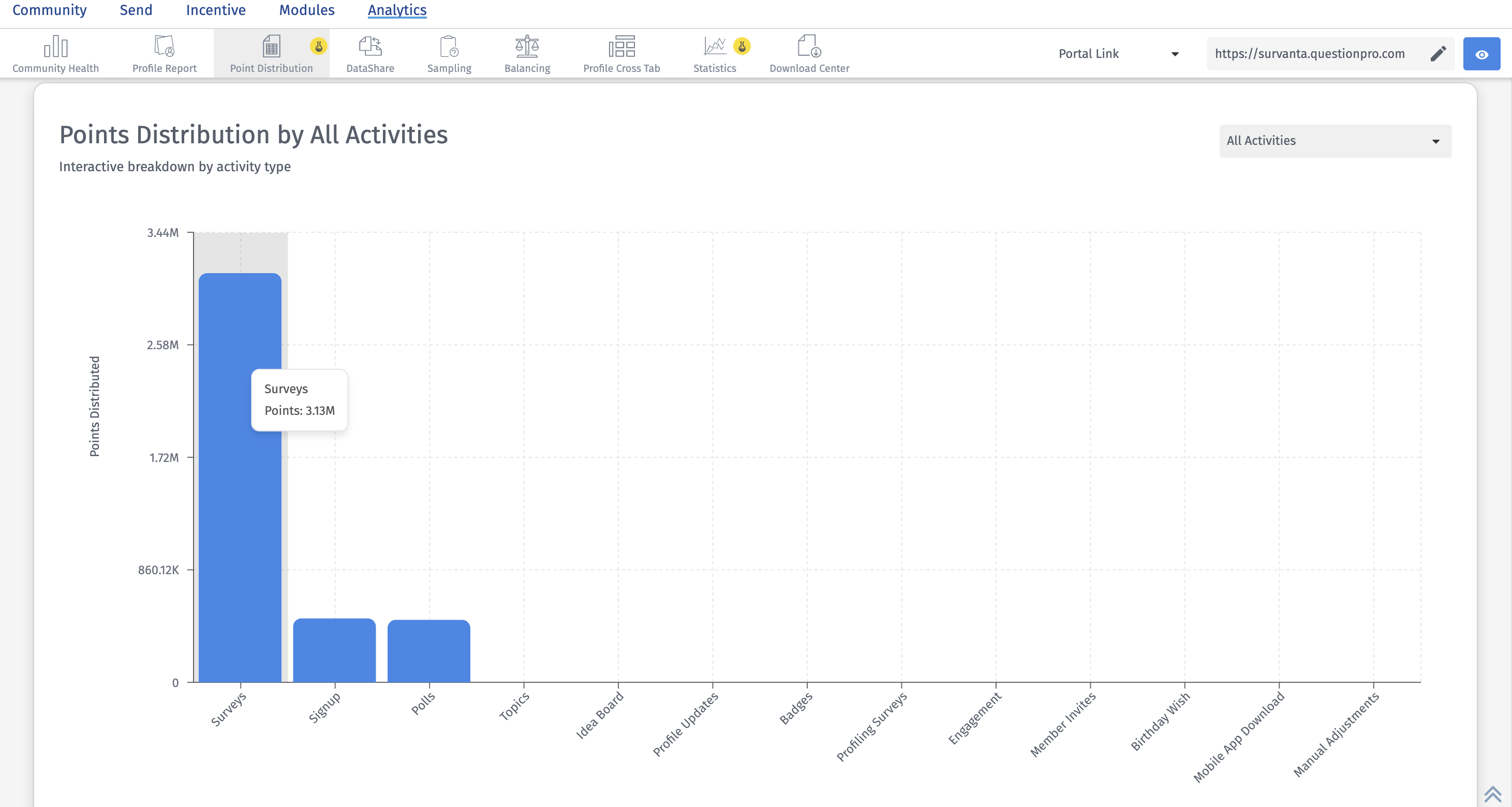 This view shows how points are distributed across different community activities, such as surveys, polls, topics, referrals, signup, and other supported actions. It helps you understand which activities are contributing the most to overall point distribution.
You can use the activity dropdown to filter the chart by a specific activity type. Once an activity is selected, a secondary dropdown may appear to help you drill down further into a specific initiative within that activity.
This view is useful for understanding which engagement areas are driving the most point accumulation.
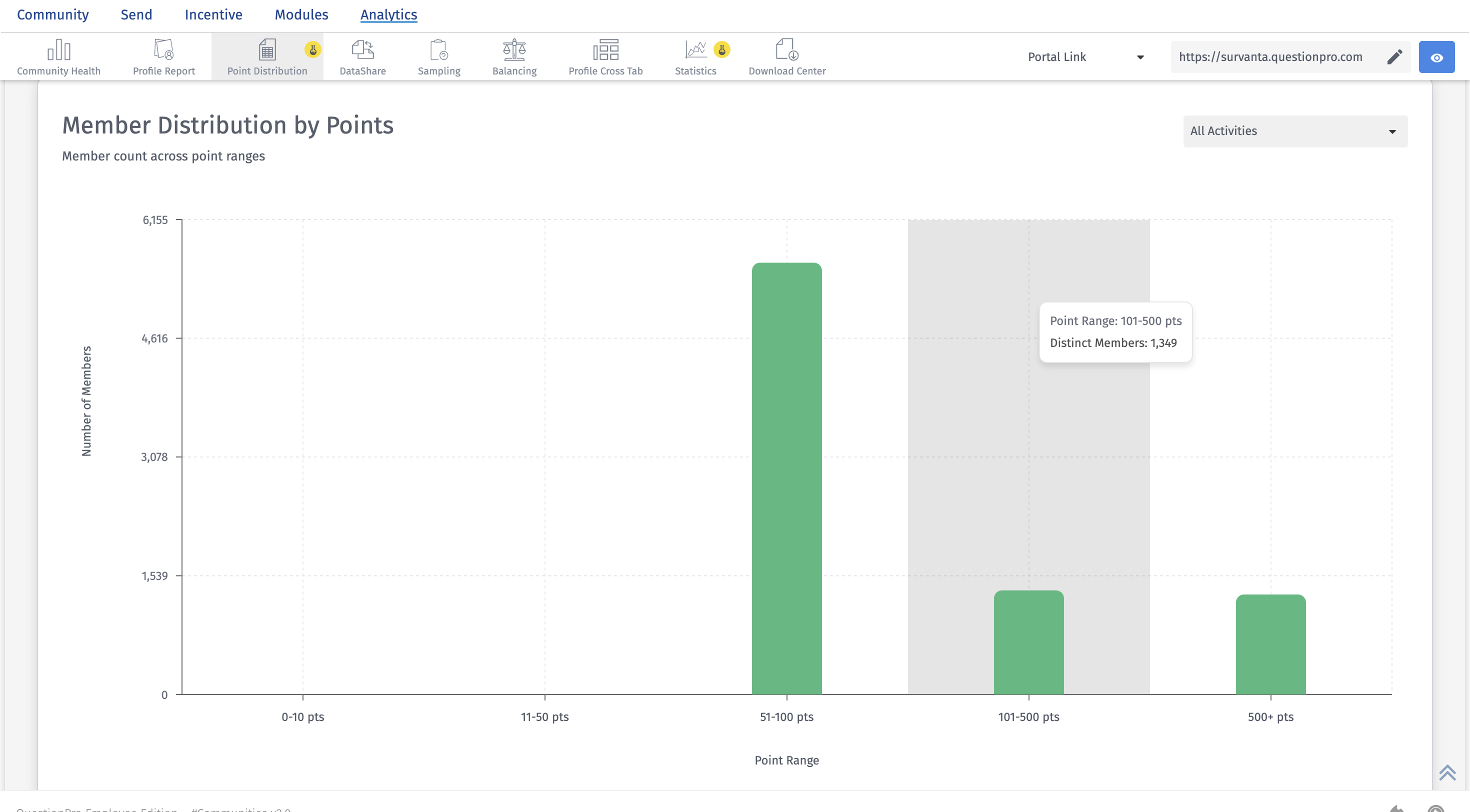 This view shows how members are distributed across different point ranges. It helps you understand how many members fall into low, medium, or high point brackets during the selected timeframe.
- identify highly engaged members
- spot members with lower point accumulation
- compare member distribution by activity type
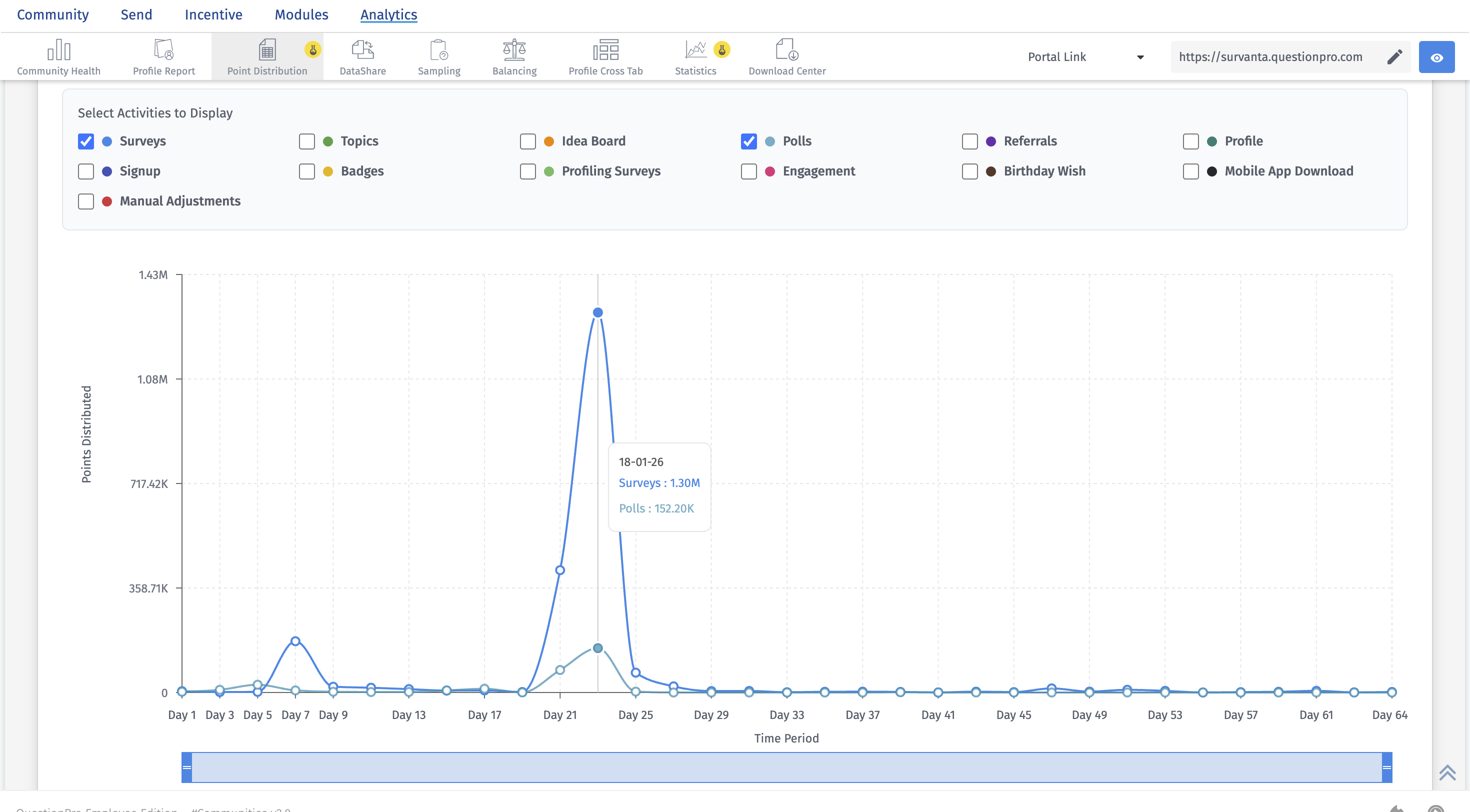 The Points Trend Over Time chart shows how points fluctuate over time across selected community activities. This helps you identify engagement patterns, spikes, and declines in point activity.
You can use the activity checkboxes to choose which activities to include in the chart. The chart can also be viewed in different intervals:
- Daily
- Weekly
- Monthly
- Quarterly
- Members Earning Points: Shows how many unique members earned points during the selected timeframe.
- Total Points Distributed: Shows the total number of points awarded across all supported activities in the selected timeframe.
- Average Points per Member: Shows the average number of points earned per participating member.
- Points Distribution by All Activities: Shows which activities are driving the most point allocation across the community.
- Member Distribution by Points: Shows how members are spread across point ranges, helping you understand concentration of engagement.
- Points Trend Over Time: Shows how point activity changes over time for selected activities, making it easier to identify trends and shifts in engagement.